
CLEANING COMPANIES · CONCEPT STUDY
Pristine Cleaning
A polished cleaning direction in deep purple.
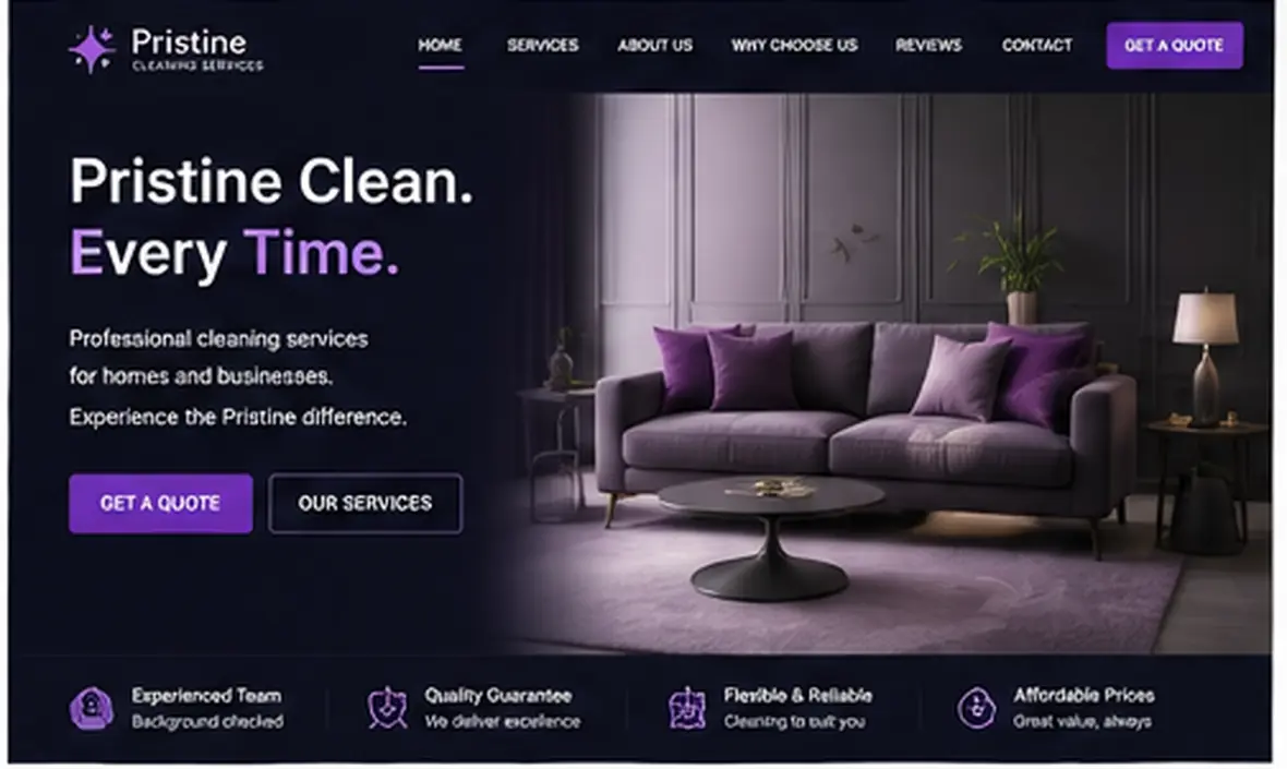
A styled interior, aubergine tones and violet accents create a considered visual identity. The service introduction remains clear within the richer colour treatment.
Pristine Cleaning is an Olive Beacon design study, not a client project. The fictional brand explores website design for cleaning companies. Any figures, reviews or credentials shown are illustrative.
IndustryCleaning Companies
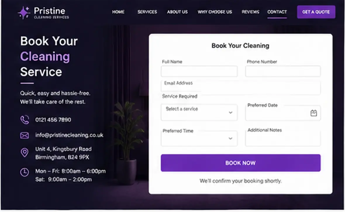
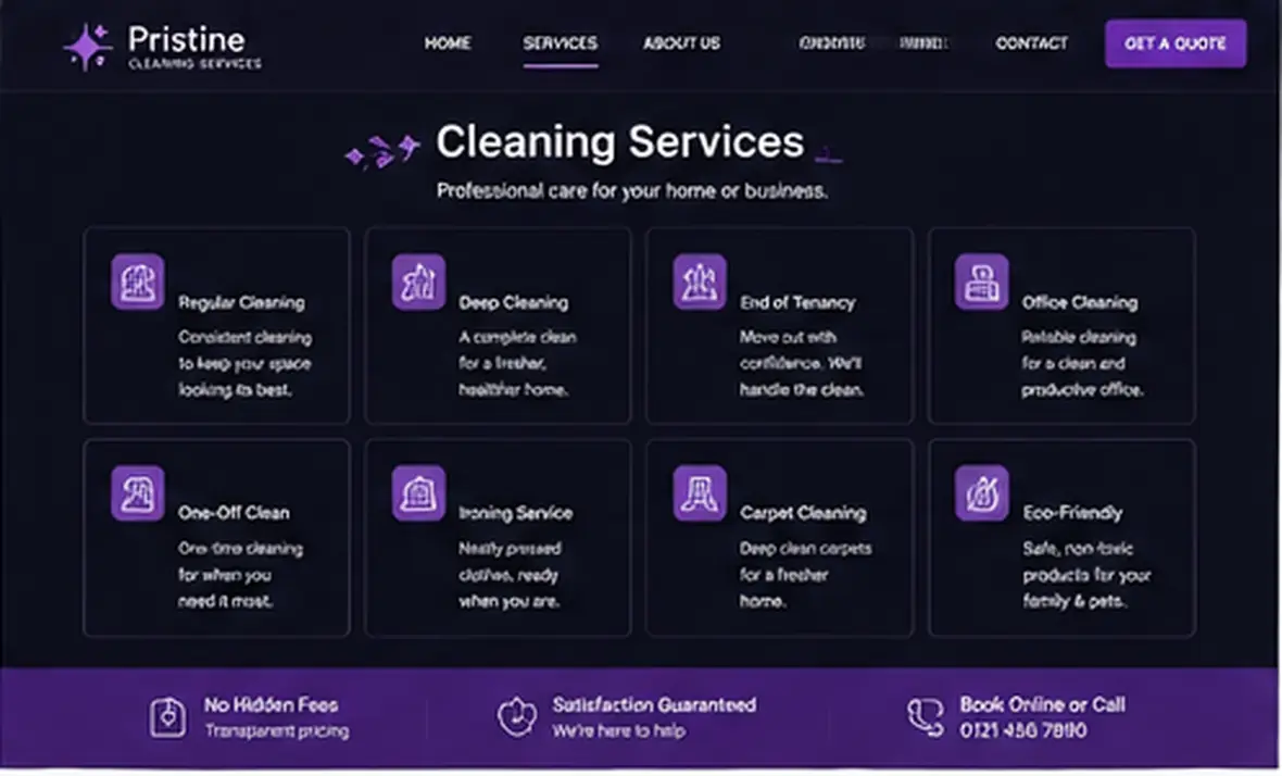
PagesHome, Booking, Services
DirectionA polished cleaning direction in deep purple
#000018#303030#484848#606060#A890A8
THE WALKTHROUGH
Explore the 3-page design.
View all three screens from the design study.
NEARBY
Other directions for Cleaning Companies.
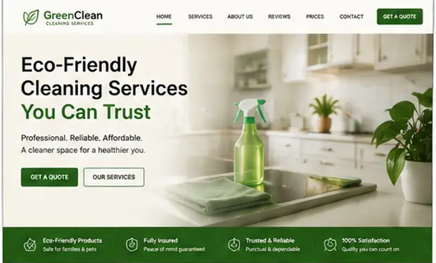
Explore another visual approach to this industry.

START A PROJECT
Could this direction suit your business?
Tell us what you like about the study and what your website needs to achieve. We can discuss how the direction could be adapted to your brand.